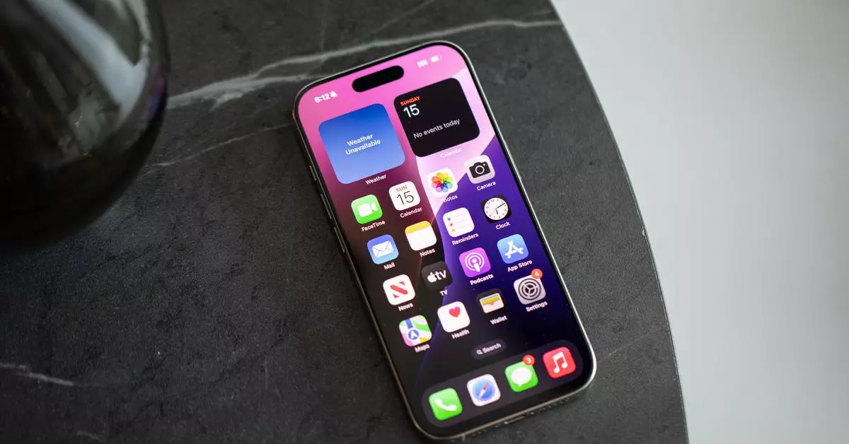
In the realm of smartphone technology, particularly within the iOS ecosystem, users have traditionally confronted a grid of app icons that dictate their daily engagement with their devices. For many, this grid has been a comforting yet limiting format for app organization, representing safety and familiarity. However, as these devices have evolved, so too has the way we interact with them. With the recent innovations brought forth by iOS updates, users are now tasked with re-evaluating their homescreen practices and the potential for a more streamlined, productive interaction with their devices.
As technology progresses, the accumulation of digital applications has led many users, including myself, to experience a sense of overwhelm when staring at a crowded homescreen. What was once a manageable number of applications has ballooned to an excessive quantity, revealing a paradox of choice. While earlier versions of the iOS system maintained a straightforward approach—placing each newly downloaded app directly onto the homescreen—this practice has become increasingly untenable. With almost 60 applications needing constant attention, managing that grid has become akin to sorting through a disorganized attic.
On the Android platform, users have long been afforded the privilege of a more adaptable experience that allows for app drawer access, which keeps homescreens free of unnecessary clutter. In contrast, iOS users have historically been tied to the visual demand of app icons vying for attention. However, with the introduction of iOS 14’s widget capabilities and the app library, the seeds for a more individualized approach started to blossom. The most recent update—iOS 18—propels this further, allowing users significant flexibility in icons and widget arrangements, yet many still struggle with the nostalgia of the familiar grid.
Rather than falling back into old habits, I embarked on an hour-long journey to revitalize my homescreen layout. To highlight the potential strengths of the new updates, I systematically deleted underused apps and restructured my favorites into a minimalist aesthetic. By privileging functionality over mere presence on my screen, I transitioned from a crowded grid to an elegantly curated interface of only four apps in the dock and a few essential widgets. I affectionately nicknamed this revamped layout “Windows Phone 2.0,” signaling a clear break from the chaos of the more traditional designs.
This newfound aesthetic did not come without its anxieties. The fear of losing access to certain applications lingered. However, I quickly realized that most of the time, the applications I sought were easily accessible through the intelligent suggestions of Siri, a feature that has gained significant improvements in its predictive capabilities. Instead of being bombarded by persistent notification badges that previously acted as unwelcome reminders of my digital obligations, the decluttered homescreen offered a sense of liberation—a necessary breath of fresh air amid the digital noise.
Interestingly, other members of my team have adopted similar minimalist techniques in rethinking their homescreen layout. Wes, our weekend news editor, has become a connoisseur of functional organization. His homescreen showcases a bounty of shortcuts and widgets, employing playful grayscale icons that effectively minimize distraction. For Wes, the duality of effective time management and reduced screen time is paramount; he deliberately places the tools he needs right where they are most useful, paving the way for an intentional digital workflow.
Conversely, Jay, another editor, maintains a more pragmatic approach to app management. He keeps just seven apps on his homescreen, illustrating a thoughtful fusion of utility and mindfulness. This careful selection allows him to avoid the aimless scrolling that often consumes the attention of many users, emphasizing the reality that our devices, while powerful, can also become tools of distraction if not optimized for individual needs.
As the demands of our digital lives continue to evolve, it is crucial to recognize that the way we interact with our devices has not only changed but has the potential to transform our overall productivity and well-being. The characteristic icon grid—once a hallmark of mobile organization—must now be reconsidered in favor of more adaptive layouts that speak to modern lifestyles.
Our experiences underscore an exciting reality: the evolution of our digital environments can lead to a balanced interaction that bridges functionalities of human behavior with the technology at our fingertips. As we stand on the brink of a more personalized and intelligent future, it becomes clear that escaping the grid may not just be a trend; it may very well be the new norm for engaged digital citizenship. By embracing these innovative ideas and customized solutions, each of us can reclaim our devices and reshape how they fit into the narrative of our lives.


Leave a Reply